Showing posts with label Fix-it Friday. Show all posts

Friday, March 26, 2010

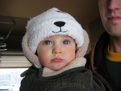
Fix-It Friday #48

Fix-it Friday picture, courtesy of the author of this blog.


My fix, using PSE7:

Sorry I don't have time at the moment to elaborate on my process... my children are calling. Comments and critiques are much appreciated!

Friday, November 6, 2009

Fix-It Friday #35

Another "Fix-It-Friday" from iheartfaces. Haven't done one of these for a while, but since I've been doing some photo editing lately anyway, I figured it would be nice to take a break with a fresh, pretty face. :-)

Original photo, which can be found here, taken by the author of this blog.


My fix:


My editing steps (using PSE7):
* Rotated the photo (obviously ;-)).
* Shadows / highlights -- lightened shadows, darkened highlights a twinge, and brought up midtone contrast just slightly.
* Brightness / contrast -- brought both these up a little.
* Cropped just a little off the top and left side.
* Adjust hue / saturation -- increased saturation of red tones.
* Sharpened a bit.
* Applied unsharp mask.
* Used the blur tool on her skin a little (which didn't do a whole lot).
* Brought up temperature to a slightly warmer (more yellow) tone.
* Ended up bringing the highlights back up in the end, so that probably undid some of my first step. ;-)

And there you have it!

Saturday, August 8, 2009

Fix-It Friday #23

Well, I thought I'd try my hand at another Fix-it Friday picture, and for the first time I used (mostly) PSE7 to do it. I played with certain features of this one more than usual in (probably) quirky ways, but for the most part I left the rest of the picture pretty similar to the original. That probably doesn't make any sense until I explain it, though. :-)

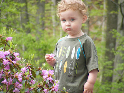
Here is the original photo, taken by the writer of this blog:


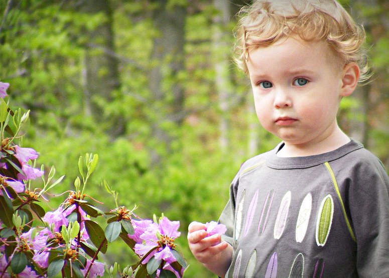
Here is my edit:


What I did:
* First of all, I wanted to crop the picture down to get this cute little guy on one side. But to do that, I kept having to crop out most of the pretty flowers. So I figured, what the heck... I'll move the flowers. So I did:
-- Selected the flowers using the Quick Selection tool.
-- Created a new layer via copy.
-- Used the Move tool to move it upward and over to the left a little.
-- Flattened the image.
-- Used the Clone Stamp tool to blend it in a bit.

* Next, I was not crazy about how the colors of his shirt clashed with the flowers. So I changed the colors of his shirt. :-)
-- Selected most of the shirt.
-- Turned down the saturation.
-- Played with the hue until it more or less matched the flowers. (I didn't even have to play with the individual surf boards on his shirt... At whatever hue it was, they all suddenly matched at the same time!)

* Then I turned to the more minor points of lighting and color, and that was the easy part.
-- Lightened the shadows a bit.
-- Brought up the midtone contrast a little.
-- Brought up the overall contrast a tiny bit.
-- Sharpened it some.

* Then I used the clone stamp tool (turned down to about 20% opacity) to lighten the dark spots under his eyes.

* And finally, I added a vignette. For this, I had to leave PSE7 and go back to my old standard Picnik, because I cannot for the life of me figure out how to do a decent vignette in PSE. If anyone has any advice on that matter, please let me know! :-)

I am still very new to Photoshop, so if this looks like a rookie's work... it is, lol. If you have any other comments or critiques on my fix, or advice on using PSE7, I would love to hear them! Thanks for visiting!

Friday, June 26, 2009

Fix-It Friday #18

This pic was not at all difficult to "fix" -- it was already so precious! But here are the edits that I came up with.

Original photo, by the author of this blog:


My edition version:


Again not being terribly specific, here are the general steps that I took in my editing process (using Picnik):
1) Crop -- cropped it down to a better-focused, more interesting composition (in my opinion at least :-p).
2) Curves -- adjusted the lighting, adding more exposure and contrast.
3) Gritty -- to mute the color slightly and make the lines (local contrast) "pop" a little more. (This is probably my favorite Picnik tool, as you may be able to see from my edited pics so far on this blog. :-p)
4) Focal zoom -- to mute the background and put more focus on this beautiful face.
5) Soften -- only on the skin, to give it a smoother appearance.
6) Zombify -- on the eyes, to bring out the catch light just a tiiiiny bit more.
7) Saturation -- putting a teensy bit more color back in there. :-)
8) Matte -- to soften the edges of the photo.
9) Frames -- self-explanatory. :-)

Friday, June 5, 2009

Fix-It Friday #16

I've never participated in the iHeartFaces Fix-it Friday challenge before, but this one looked like a fun challenge that was too good to pass up.

Here is the original photo, taken by the author of this blog.


And here it is with my edits.


Just for fun, here's what I did, using the online editing program Picnik, the premium version. (I'm not going to be incredibly detailed, but here are the basics.)

1) Exposure -- added more highlights and upped the contrast a little. Also some local contrast to add more definition.
2) Curves -- to adjust the color.
3) Clone -- to clean up the under-eye area.
4) Vibrance -- to bring out more color, especially in the eyes.
5) Black and White, then Vibrance again -- to mute the color ever so slightly and then bring it back out in certain key features such as the eyes, lips, and cheeks.
6) Zombify -- to bring out more depth in the eyes.
7) Frames -- self-explanatory. :-)

And there ya go. Sometimes I have even more fun editing pictures than taking them, so this turned out to be a great thing for me! :-)